Basic information
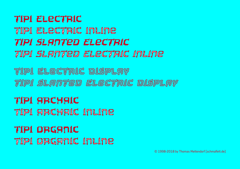
Tipi-SlantedElectric.otfTipi-ElectricInline.otfTipi-SlantedElectricInline.otfTipi-ElectricDisplay.otfTipi-SlantedElectricDisplay.otfTipi-Archaic.otfTipi-ArchaicInline.otfTipi-Organic.otfTipi-OrganicInline.otfNote of the authorTIPI is my very early attempt to create a techno typeface by using a grid. But somehow the result called TIPI ELECTRIC didn't really look technoid, but had a rather decorative and ethnic appearance. This kind of paradox lead to the variations TIPI ARCHAIC & TIPI ORGANIC to take this impression a bit further. (The name TIPI is just a hint in the ethnical direction, while not explicit referring to north american natives and their tents. After all, it's just a pretty short name, that looks good to me set in this typeface.)
TIPI is using equal metrics from Plain to Inline and therefore can be used as a layer font, e.g. to give the inlines a different colour. (Exeption: TIPI ELECTRIC DISPLAY has no layerfunction.)
I designed TIPI in 1998. Actually, I had an ambivalent relation to the result and didn't even think of releasing it in any way. In consequence it disappeared in a long row of CD ROM backups which I reviewed recently because I realized that these old backups like to become unreadable over the years. So, what you get here is a type design shown to the world about 20 years after its creation
now, maybe someone has an idea where to apply such an unique typeface?
Thomas Mettendorf
www.schmalfett.de
First seen on : July 01, 2018
 Tipi-Electric.otf
 ➥
➥
 Free and high-speed download of massive fonts, targeted customer service:info@10font.com